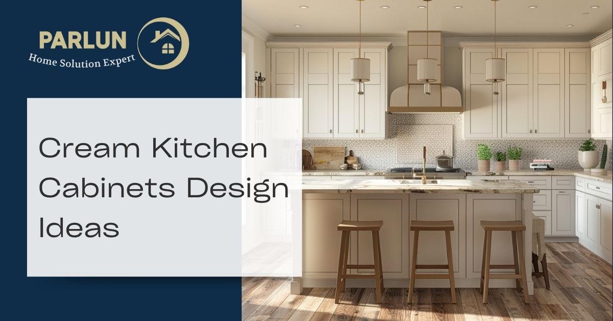
Cream kitchen cabinets sit in the warm middle ground between pure white and heavier neutrals like beige or greige. They bring softness and warmth to a kitchen without committing to a strongly coloured scheme, making them one of the most versatile finishes a homeowner can choose. The challenge is that cream is not one tone: it covers everything from a barely-there warm white to a rich ivory leaning toward yellow. Picking the wrong shade for your light conditions or existing materials is the single most common mistake. This guide covers shade selection, coordinating countertops, hardware, walls and flooring, and how to keep cream cabinets looking current.
Quick Summary of Cream Kitchen Cabinets
Cream kitchen cabinets offer warmth and versatility that pure white cannot match. The right shade depends on your light source, floor tone and countertop material, and should always be tested as a large painted sample in the actual room before committing.
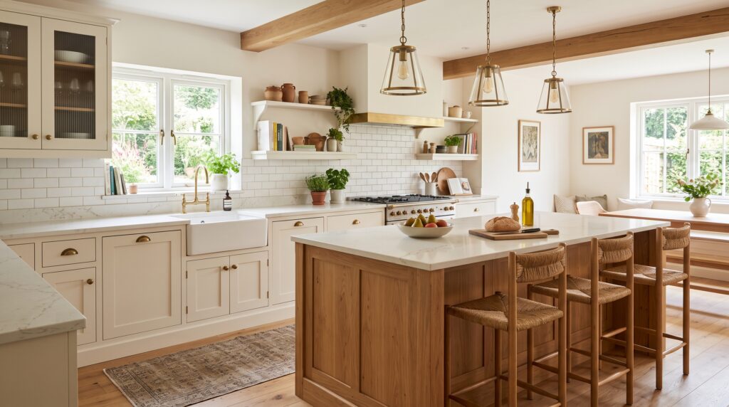
Among the strongest current options are Farrow and Ball’s Clunch and String, Benjamin Moore’s Pale Oak and White Dove, and Sherwin-Williams’ Antique White. Cream shaker cabinets give the most design flexibility across traditional and transitional schemes, while flat panel cream doors carry the tone into contemporary spaces cleanly. In a small kitchen, a consistent handleless cream run keeps the space feeling open and warm.
For countertops, warm white quartz, marble-look stone and butcher block all pair well. Brass and unlacquered brass hardware is the most popular choice; matte black also works well for sharper contrast. The main pitfall is a cream with too strong a yellow undertone, which becomes visually heavy under warm artificial light. Getting undertones right is the foundation of every other decision.
Cream Compared with White Off White Beige and Greige
Choosing between these tones is easier when you understand what separates them. All four sit in the light neutral range but carry different undertones, warmth levels and behaviour in natural and artificial light.
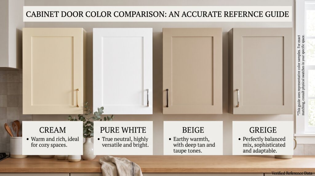
Cream has a distinctly warm undertone, typically yellow or pink. It is richer than off white and lighter than beige. It comes across as a deliberate warmth choice rather than an almost-white.
Off white covers anything that is white with a hint of another colour added. It can lean cool, grey or blue depending on the paint. In a kitchen, off white reads lighter and cleaner than cream.
Beige sits deeper in the scale than cream and carries a stronger yellow-brown undertone. It can feel heavy in rooms with limited natural light and has a stronger traditional association.
Greige blends grey and beige. It can sit on either side of the warm-cool divide depending on the grey base used, and generally comes across as more contemporary than cream or beige alone.
The table below sets out the clearest distinctions for a kitchen context.
|
Tone |
Undertone |
Warmth |
Main Risk |
Best Paired With |
|---|---|---|---|---|
|
Cream |
Yellow or pink |
High |
Goes yellow under warm artificial light |
Brass, wood, warm stone |
|
Off White |
Slight grey or blue |
Low-medium |
Can look cold or clinical |
Stainless steel, cool stone |
|
Beige |
Yellow-brown |
High |
Can feel heavy or dated |
Warm floors and natural materials |
|
Greige |
Grey-beige blend |
Medium |
Can appear flat without contrast |
Dark wood accents, matte black |
How to Choose the Right Cream Shade
No two kitchens behave the same in terms of light. A cream that looks fresh and warm in a south-facing showroom can turn dull and yellow in a north-facing kitchen. Testing in context is non-negotiable.
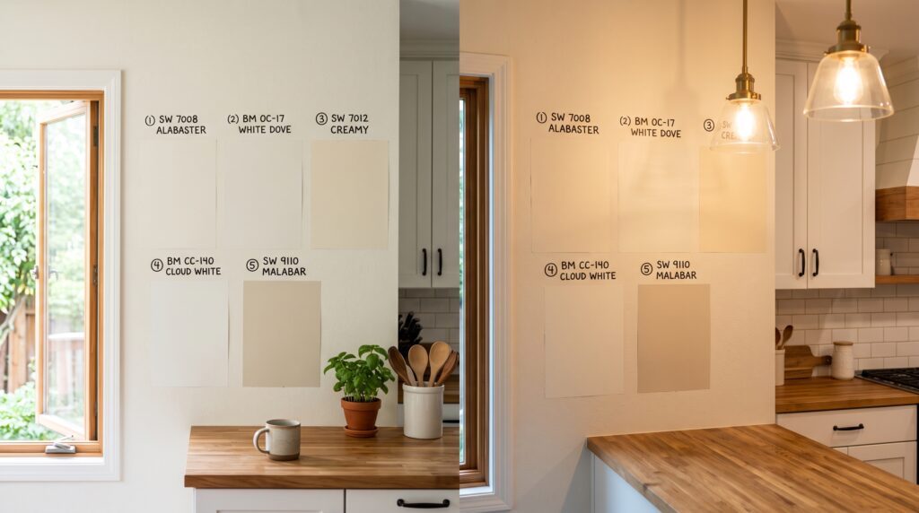
Start by identifying which direction your kitchen faces. South-facing rooms receive warm, consistent light and can handle creams with a stronger yellow or pink undertone without tipping. North-facing kitchens receive cooler, indirect light. A cream with a strong yellow base will shift noticeably in these conditions; a cream with a pink or neutral undertone holds better.
Request a large painted sample rather than a small chip. A panel of at least 30 by 40 centimetres on the actual wall gives a far more accurate reading than a palm-sized chip held to a cupboard door. Paint several options and observe them at different times of day and under your existing artificial lighting. Warm incandescent or LED lighting at 2700K intensifies any yellow undertone. Cool LEDs at 4000K can strip the warmth back entirely.
Hold each sample against your countertop edge, floor tile and any white trim or appliances already in the room. A cream that looks balanced in isolation can pull strongly yellow when placed next to a cooler white.
Lighting and Undertone Checklist
Cream Kitchen Cabinet Design Ideas
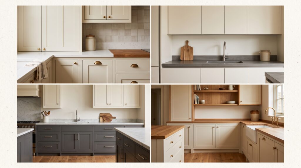
Cream Shaker Cabinets
Shaker doors in cream are the most popular configuration for good reason. The simple routed frame adds structure without weight and suits everything from traditional farmhouse kitchens to transitional schemes. Cream shaker cabinets pair most naturally with aged brass hardware, butcher block or quartz countertops and a warm tile or stone backsplash. An inset shaker produces a more tailored finish; overlay shaker is cleaner and more cost-effective.
Flat Panel Cream Cabinets
Flat panel cream doors bring the colour into contemporary territory. Without the routed frame of a shaker, the surface becomes about finish quality and colour alone. This version works best with integrated pulls, linear handles or a push-to-open mechanism, and pairs well with stone countertops and minimal styling.
Cream and Wood Kitchen
One of the most requested combinations at present is cream upper cabinets with a natural wood lower or island. The contrast between the warm painted surface and the grain of oak, walnut or ash produces a layered, organic result. Keep the wood finish matte or oiled rather than lacquered to avoid a dated appearance.
Two-Tone Cream Kitchen
Two-tone schemes using cream uppers with a contrasting lower cabinet are among the more practical design moves available. Navy, forest green and charcoal all sit comfortably against cream without fighting the undertone. A painted island in a deeper tone acts as a natural anchor for the whole scheme.
Glass Front Cream Cabinets
Glass-front upper doors in cream frames lighten the upper run of a kitchen by opening up the surface. This approach suits both traditional and modern kitchens and works particularly well in rooms with limited natural light where solid cream uppers might feel heavy.
Cream Pantry Wall Cabinets
Tall cream cabinets used as a continuous wall run produce a unified, high-volume look without the commitment of full cabinetry on every wall. Because the surface area is large, cream is well suited here: it adds warmth without the heaviness that a painted dark tone can generate in a dedicated pantry wall.
Best Countertops for Cream Cabinets
Cream cabinets are unusually versatile in terms of countertop pairing because their warm undertone works with both warm and cool materials. The main rule is to avoid near-matches so close in tone that they blur together without providing contrast.
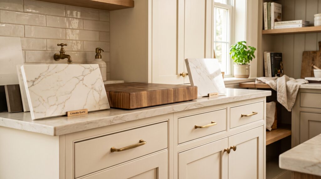
Warm white quartz is the most popular pairing, offering a clean, low-maintenance surface that harmonises with the cream without repeating it. Marble-look quartz with warm gold or amber veining lifts the combination further. Avoid marble-look options with heavy cool-grey veining; they pull any yellow in the cream into focus.
Honed grey quartz provides the clearest contrast and suits flat panel cream cabinets particularly well. Stay in the warm-grey range rather than blue-grey to avoid visual tension.
Butcher block adds natural warmth and connects the cream to the wood family, which suits farmhouse and transitional kitchens especially well. It requires sealing and occasional oiling. Soapstone offers a quieter dark option; its soft, chalky surface suits cream better than polished granite.
|
Countertop |
Why It Works with Cream |
Watch Out For |
|---|---|---|
|
Warm white quartz |
Harmonises in tone without clashing |
Near-match undertones can blur together |
|
Marble-look quartz |
Adds elegance and visual lift |
Avoid heavily cool-grey veined options |
|
Honed grey quartz |
Clean contrast suits modern schemes |
Blue-grey can fight warm undertones |
|
Soapstone |
Soft depth and warmth |
Requires regular oiling |
|
Butcher block |
Natural warmth and grain |
Needs sealing and maintenance |
|
Warm granite |
Character and movement |
Confirm undertone against your cream first |
Backsplash Hardware Walls and Flooring
These four surfaces either reinforce or undermine the cream cabinet choice.
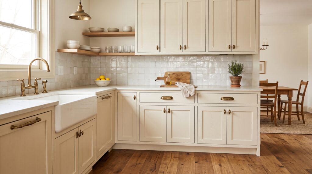
Backsplash. Handmade zellige in a warm white or cream tone adds handcraft and texture without colour contrast. Elongated stone tile, plaster-painted tile and warm-toned subway tile all sit naturally with cream. A terracotta or clay-toned tile adds warmth and suits the more traditional end of the style. Avoid cool metallic tile and anything with a blue or green undertone.
Hardware. Aged brass and unlacquered brass are the most popular choices for cream cabinets. The warm metal tone aligns with the yellow and pink undertones in the cream and ages gracefully over time. Matte black provides the sharpest contrast and works particularly well on flat panel cream doors or in a two-tone kitchen where the contrast is intentional. Brushed nickel and polished chrome run cool and tend to make cream appear dated. For traditional schemes, oil-rubbed bronze is a strong alternative.
Wall colour. Cream cabinets sit most comfortably against warm white, soft sage, muted clay and warm greige and taupe tones. Stark white walls expose any yellow in the cream and create an uncomfortable gap. Cool grey walls pull the cabinet finish out of the warm range and introduce visual tension.
Flooring. Wide plank oak flooring is the most requested pairing for cream cabinets, combining warmth and grain without competing with the cabinet colour. Warm limestone tile, travertine and terracotta continue the warm palette into the floor. Avoid cool-toned grey porcelain, which fights the warmth of cream from below and can make the whole kitchen feel disconnected.
How to Keep Cream Cabinets Looking Modern
Cream has a long association with country and traditional kitchens, but that association is not automatic. The door profile, hardware choice and finish make the difference.
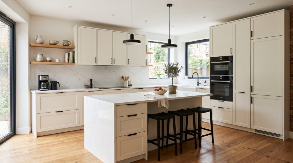
Flat panel doors in cream remove any traditional association immediately. A slim shaker profile with a narrow frame sits comfortably in a transitional or contemporary space. The shaker with wide rails and stiles is the profile most likely to tip the scheme toward a traditional or farmhouse character.
Limit yellow undertones by choosing a cream that leans pink or neutral. Keep hardware in a single finish and keep it simple. Avoid ornate handles, routed patterns and exposed hinges unless the traditional direction is intentional. A matte surface in any cream tone ages better and appears more contemporary than a semi-gloss or gloss alternative, and is significantly easier to maintain without showing fingerprints and scuff marks over time.
A consistent cream throughout the full cabinetry run also looks cleaner and more modern than a scheme where cream is mixed with a second painted tone that was not planned as a deliberate two-tone decision.
Custom Cream Kitchen Cabinets from Parlun
Parlun Building supplies cream kitchen cabinets direct from the factory, with a full range of warm neutrals available from barely-there ivory through to richer ecru and warm greige-cream blends. Both shaker and flat panel door profiles are produced to order. Unlike showroom-stocked finishes, Parlun’s factory process supports custom colour matching to a paint code, reference swatch or existing sample, so your cabinet finish can be dialled in to a specific undertone rather than settled on as a nearest available option.
A sample door in your chosen finish and profile is produced before any full order is confirmed, giving you the chance to test the colour in your own kitchen under your own lighting conditions. Lead times, pricing and minimum quantities are discussed directly with the team. To request a finish sample or begin a conversation about your project, reach out through the Parlun Building contact page.