Hickory is one of the most visually striking timbers used in kitchen cabinetry, and one of the most challenging to design around. A single hickory cabinet door can contain everything from pale cream sapwood to rich amber heartwood, with knots, streaks and grain variation running across the same surface. This built-in contrast is what makes hickory arresting, but it also narrows the range of colours and finishes that work alongside it without creating visual competition. Choosing a colour scheme for a hickory kitchen is less about finding a favorite wall colour and more about finding surfaces that give the wood room to breathe. This guide works through every surface in turn.
Quick Summary of Colour Schemes with Hickory Cabinets
The safest colour scheme for hickory cabinets is built on warm neutrals throughout.
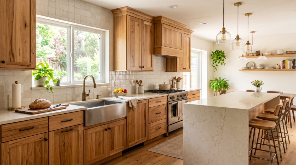
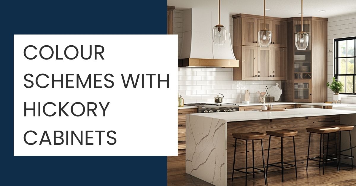
Warm white or cream walls, a low-movement cream or white quartz countertop, a simple subway tile or zellige backsplash and a light stone or tile floor give hickory the quiet backdrop it needs. For hardware, matte black provides the cleanest modern contrast; oil-rubbed bronze and aged brass align with the warm amber heartwood tones. Because hickory already supplies the visual interest, every surrounding surface should be calmer by comparison.
Stronger contrast is possible when walls are light and the countertop is kept plain. Avoid cool greys, busy stone surfaces and wood floors that sit close to hickory in tone without being an obvious match. Among natural wood kitchens, colour schemes with hickory cabinets work best when they treat the wood itself as the feature and let everything else recede.
Understanding Hickory Colour and Grain
Hickory’s defining characteristic is the extreme variation between its sapwood and heartwood. The sapwood is pale, ranging from cream to near-white with a warm yellow base. The heartwood is significantly darker, running from amber to reddish-brown and sometimes deep chestnut. Both appear on the same door, sometimes within the same stave, giving hickory a higher-contrast appearance than virtually any other domestic timber species.
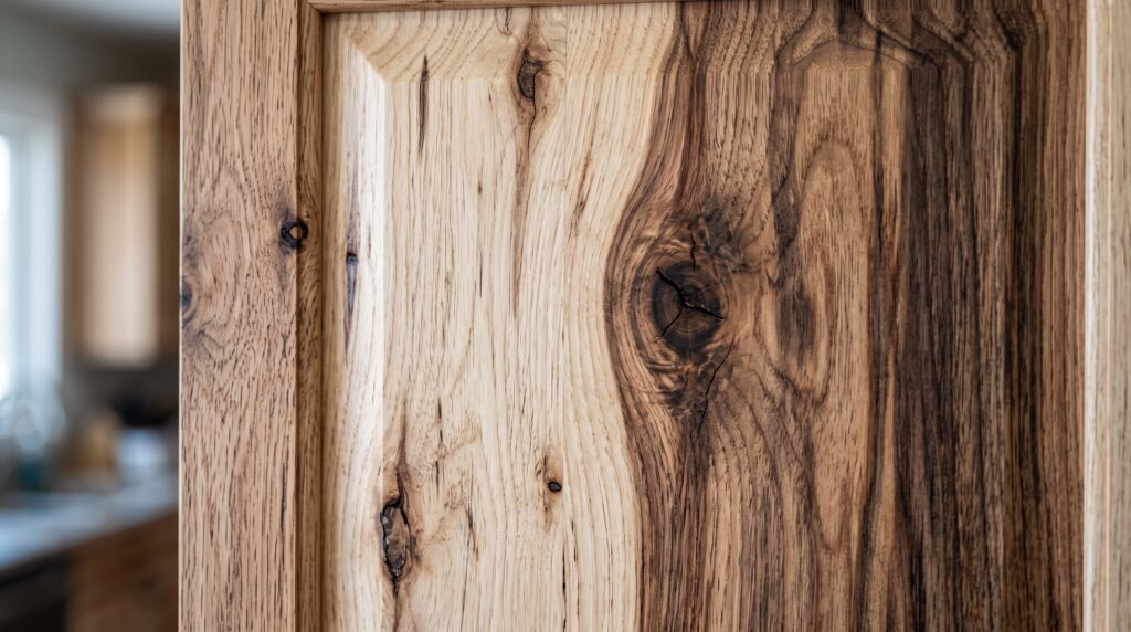
On top of this colour variation, hickory carries a pronounced grain pattern with occasional knots and dark mineral streaks. The texture is coarse enough to be visible even at a distance. All of this means that the cabinet itself is already doing a great deal of visual work before any surrounding surface is considered.
When selecting finishes and colours, always make decisions against an actual hickory cabinet sample rather than a photograph. The variation differs between batches and even between doors in the same order. What works against one sample may not hold against another.
Hickory Undertone Guide
|
Wood Tone |
Colour Range |
Undertone |
|---|---|---|
|
Sapwood |
Pale cream to yellow-white |
Warm yellow |
|
Heartwood |
Amber to reddish-brown |
Warm orange-red |
|
Overall |
High-contrast pale to dark |
Warm amber |
All three zones carry warm undertones. Warm whites, cream, warm greige and muted sage support this warmth; cool grey and blue-based whites work against the amber and should be avoided.
Best Wall Colours with Hickory Cabinets
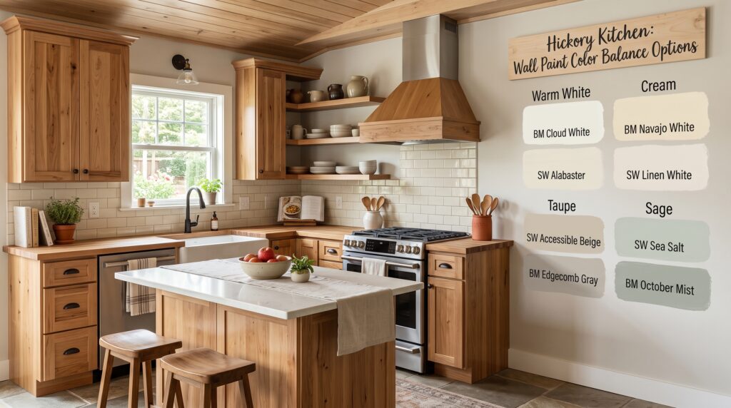
Because hickory supplies so much pattern and tonal range itself, wall colours should be chosen for what they do not do as much as for what they do. The goal is a surface that holds the room together without drawing the eye away from the wood.
Warm White
Warm white is the safest and most widely used wall colour with hickory cabinets. It reflects light, keeps the focus on the wood grain and allows the cabinet’s full tonal range to show without colour competition. Look for whites with a yellow or pink undertone rather than a grey or blue base.
Cream
Cream picks up the sapwood tones in the door and gives the kitchen a cohesive warmth from floor to ceiling. Avoid creams with a strong yellow base, which can push the amber heartwood toward orange in warm artificial light.
Beige and Warm Greige
Beige and warm greige add depth to the palette while keeping the scheme neutral and warm. They suit kitchens where the hickory is a darker or stained variety rather than a fully natural finish with a high proportion of pale sapwood.
Taupe
Taupe adds sophistication without introducing colour competition. A warm taupe with a brown bias rather than a grey one sits naturally alongside hickory and works particularly well in transitional or traditional kitchens.
Muted Sage and Green
Muted sage is one of the strongest complementary choices for hickory. Green sits opposite warm amber on the colour wheel, creating a pleasing natural contrast without visual conflict. Keep the green muted and dusty rather than bright or saturated.
Soft Blue
A soft, warm-based blue can work in a hickory kitchen when some deliberate contrast is wanted. Avoid cool, grey-based blues, which fight the amber heartwood and make the wood appear orange rather than warm.
Grey
Grey requires care alongside hickory. A grey with a warm brown or greige base can work; a cool blue-grey will clash with the amber undertones and is best avoided entirely.
Wall, Countertop and Floor Pairing Table
|
Hickory Style |
Wall |
Countertop |
Floor |
|---|---|---|---|
|
Natural finish |
Warm white or cream |
Cream quartz (low movement) |
Light stone or porcelain tile |
|
Natural with sage walls |
Muted sage |
Plain white quartz |
Pale oak (distinctly lighter than hickory) |
|
Stained darker |
Warm greige or taupe |
White quartz |
Limestone tile |
|
Modern contrast |
Warm white |
Black quartz or dark granite |
Warm-toned large-format tile |
|
Traditional warm |
Beige or cream |
Warm granite or butcher block |
Travertine tile |
Best Countertops with Hickory Cabinets
The guiding rule for countertops with hickory cabinets is simplicity. Hickory already carries extreme surface variation. A countertop with busy veining, strong pattern or high colour movement adds a second competing layer of visual activity to the space and the kitchen becomes tiring to look at.
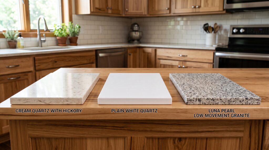
Cream quartz with minimal pattern is the strongest pairing. It echoes the sapwood tones in the cabinet door, ties the countertop and the wood together tonally and provides a quiet, clean surface that supports rather than competes with the grain.
Plain white quartz works well when more contrast between the countertop and the cabinet is wanted. Choose a warm white rather than a cool one. A blue-white or bright cool white will fight the amber heartwood in the same way a cool grey wall does.
Low-movement granite in beige, cream or warm brown tones is the classic pairing for natural hickory kitchens. The stone adds character through its mineral variation but keeps the overall pattern level low enough that hickory can still dominate. Compare this with walnut kitchen cabinets, which follow a similar principle of pairing a characterful grain with a quieter surface.
Dark stone and black quartz create strong contrast and suit a more contemporary interpretation of a hickory kitchen. When the countertop is dark and the walls are light, hickory becomes a warm middle tone rather than the dominant surface. This approach works particularly well with matte black hardware and a simple backsplash.
Avoid heavily veined marble, busy multicolour granite and any stone with a cool or blue-grey background. These compete directly with hickory’s natural pattern and produce a kitchen that looks visually overloaded.
Backsplash Ideas for Hickory Kitchens
The same principle that applies to countertops applies to backsplashes: hickory has done the pattern work already. The backsplash needs to be a quiet presence.
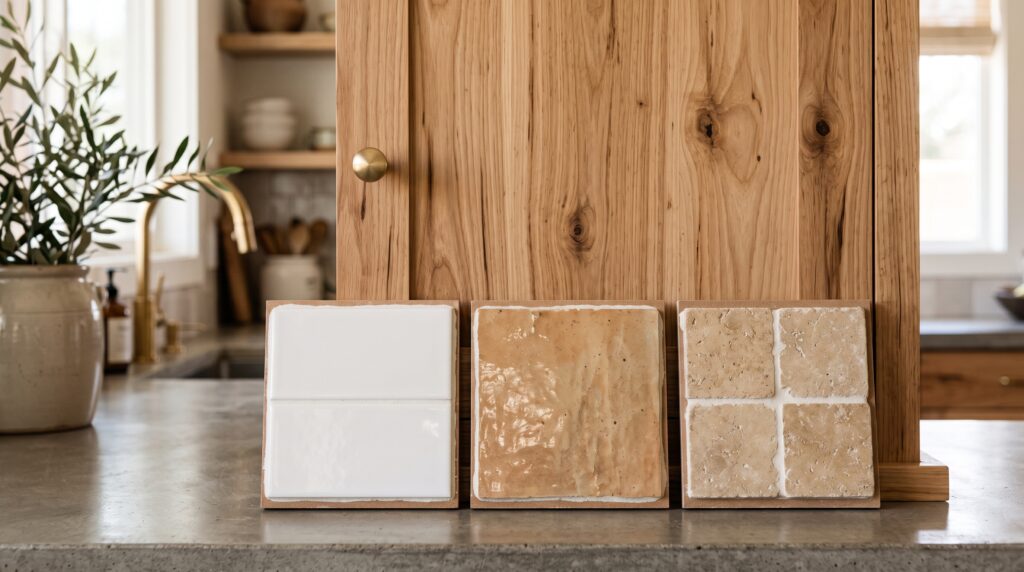
Simple subway tile in cream, warm white or a soft warm grey is the most practical and flexible choice. It provides a clean grout line, reflects light and requires no design justification. A brick or stack bond layout both work. Avoid bright white or cool white subway tile, which will make the hickory look warm-orange by comparison.
Warm zellige in a cream, ivory or terracotta tone adds handcraft texture without adding pattern. The irregular glaze surface of zellige catches light in a way that suits the organic character of hickory. This is a strong choice for kitchens aiming at a natural or artisanal aesthetic.
Limestone tile in a honed finish is a calm, low-variation option that aligns well with the warm undertones in hickory. Larger tile formats reduce the grout lines and keep the surface quieter.
Quiet neutral mosaic in a very small and uniform format can work if the colour is carefully matched to a warm neutral. Avoid anything with a pattern, colour gradient or mixed stone type.
Full-height stone or quartz slab in a plain cream or warm white is the most modern backsplash choice and works well in contemporary hickory kitchens with dark countertops or bold hardware.
Flooring with Hickory Cabinets
Flooring is where many hickory kitchens go wrong. The instinct to match or complement the cabinet with a similar wood tone creates a scheme that has too much wood activity and no anchor point.
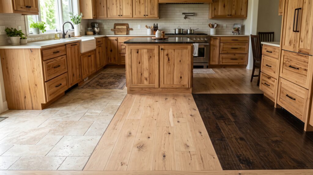
Light stone tile or porcelain in a warm neutral is the most reliable floor for a hickory kitchen. It provides clear contrast, breaks up the continuous grain and gives the eye a place to rest. Travertine and warm limestone are both natural fits.
Pale wood plank can work if it is clearly and obviously lighter than the hickory. White oak with a natural or wire-brushed finish, for example, creates a layered wood-on-wood look that works because the two tones are far enough apart. White oak kitchen cabinets follow the same pairing logic in the reverse direction.
Darker wood floors create strong base contrast and anchor the hickory visually. This works best when the dark floor is much deeper than the hickory heartwood. A floor that sits close to the heartwood colour but is a different species creates a mismatched, muddy impression. The similar-but-different appearance is more distracting than either a clearly matching or a clearly contrasting floor.
Hardware Appliances and Lighting
Hardware. Matte black is the most popular hardware choice for hickory kitchens at present. The deep neutral tone sits clearly against both the pale sapwood and the dark heartwood without competing with either. It also contributes the modern edge that natural hickory can sometimes lack.
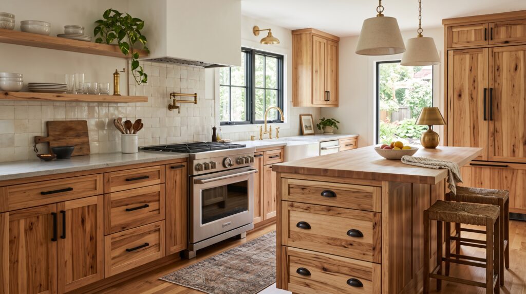
Oil-rubbed bronze aligns with the warm amber of the heartwood and suits a more traditional or transitional kitchen. Aged brass and unlacquered brass also work well for the same reason. Brushed nickel is acceptable in a transitional scheme but runs a little cool. Polished chrome and stainless bar handles both read too cold against hickory’s warm character.
Appliances. Stainless steel appliances work in a hickory kitchen provided the rest of the scheme is kept warm. If stainless looks too cool alongside the cabinet tone, a panel-ready refrigerator or a range in a dark colour such as matte black or midnight blue provides a more cohesive result.
Lighting. Pendant lighting over the island in matte black, aged brass or a warm-toned ceramic suits hickory well. Keep all artificial lighting in the warm white range, between 2700K and 3000K. Cool white LEDs at 4000K or above strip the amber warmth from hickory and flatten the grain character the timber is chosen for.
How to Make Hickory Cabinets Look Modern
Hickory has traditional and rustic associations that are difficult to avoid entirely, but the surrounding choices determine whether a kitchen sits in that direction or moves toward something more current.
The most effective steps are hardware and countertop. Replacing ornate bin pulls or antique copper hardware with matte black bar handles moves a hickory kitchen toward contemporary territory immediately. Swapping a busy granite countertop for a plain cream quartz removes the primary source of visual overload.
Beyond those two changes, painting the island or a run of upper cabinets in a contrasting dark tone, such as navy, charcoal or forest green, introduces a deliberate modern design decision rather than a natural wood-on-wood scheme. Keep the backsplash plain and the lighting modern. A natural maple cabinet kitchen follows a similar modernising logic, where quiet surfaces and strong hardware do the updating work. Limit any rustic accessories, open shelving with country-style pottery and decorative items that reinforce the traditional character rather than working against it.
Hickory Kitchen Modernising Checklist
Balance Hickory with Parlun’s Factory-Direct Painted Cabinets
A two-tone hickory kitchen, where natural hickory lowers are paired with painted upper cabinets or a contrasting island, is one of the most effective ways to modernise the look. Parlun Building manufactures flat panel and shaker cabinet doors factory-direct in warm whites, deep navy, charcoal and a full range of painted neutrals suited to this approach. If you are planning a hickory kitchen and want to contrast the natural grain with a painted finish, request a finish sample or a direct factory quotation from the Parlun team. For additional timber cabinet references, see the cherry wood cabinets and ash kitchen cabinets guides.